Getting Started
I’ve talked with numerous school district leadership over the past year and one point keeps coming up continually. Many districts are stuck in a continual loop of exporting data from their student information systems (SIS) like Powerschool or Synergy to perform ad-hoc analysis. Personnel can often spend significant amounts of time on these one-off analytics projects.
On top of the time sink, manual reporting in Google Sheets or Excel can be subject to errors and inconsistencies from the human element involved in it. This can result in long term distrust of the data and being unsure of what actions to take.
The approach that many larger districts take is to have an analytics department using a business intelligence (BI) tool like Power BI or Tableau

Your Student Information System Reporting Is Lacking
Let’s face it, the default reporting for education analytics that exists in your SiS is underwhelming. Power School for example, is reliant on Crystal Reports. Have you ever talked to anyone that’s had to build anything in Crystal? The first thing they’ll often say starts with “Ugh…”.
These reports often give simple sums of metrics across basic date ranges. They’re severely lacking in establishing insights or trends over time.
Additionally, you may have dozens of different reports to sort through that only focus on one topic each. Very few decisions are going to be made off of one data point – oftentimes many different KPIs need to be analyzed to have an accurate viewpoint.
This experience in other platforms is what makes something like Power BI so great. You can get up and running very quickly with highly dynamic and customizable reporting.

What is Business Intelligence?
Business Intelligence makes understanding what’s happening so much easier by doing the following:
– Automation of Data Updates: You can stop creating mile long spreadsheets for work outside of your SiS.
– Scalability & Organization: Tools like Power BI let you share reports with anyone in your district securely.
– Efficiency & Time Savings: Build a report connected to your SiS once, and it will stay up to date automatically each day
– Creating a Single Source of Truth: Your organization can rely on one place for all metrics and KPIs.
– Security: Easily set up reports with Row Level Security and only display relevant information. For example, you can create a single behavioral incident report for all school principals and Power BI will only let principals see their own school’s data.
– Customizable Reports: You can create any visualization of any type(s) of data in one place. Need a presentation for a board meeting? You can slap together a bunch of KPIs for your school that automatically update. What about committee that tracks performance and results? You can easily tell a story by combining data from all relevant sources in an easy to follow report.
What’s listed above just scratches the surface of what’s possible.

Power BI in Action
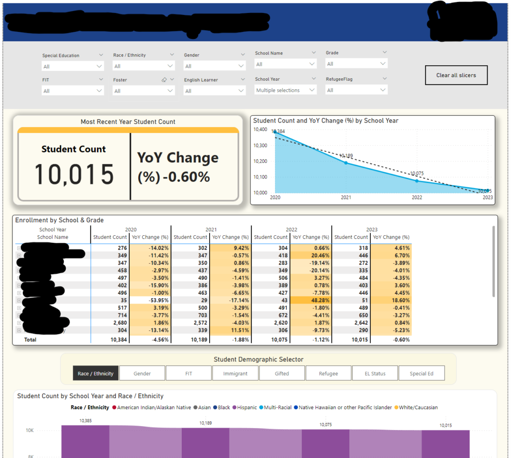
Let’s take a look at the image above for an example of using Power BI with some K-12 school data. The goal of the district leadership was to have a one stop shop for all things for actively enrolled students for not only district staff, but school principals as well.
They wanted to be able to plan for future staffing needs at specific schools and understand the trends over time. Power BI makes this endeavor into education analytics quite simple by telling a story with data. Upfront we have a large KPI card that explains what the current enrollment is at as of this very day. On top of that, the year over year change % is displayed.
We can see a line chart with labels for each year with a trendline. Finally we have a table at the bottom that displays similar data, but for individual schools. The yearly enrollment numbers are displayed with the YoY %. Additionally, we’ve added some simple color coding that highlights outliers in various shades of orange. We can see the second school in the list is experiencing significant student population growth in the past couple of years.
While not immediately obvious from the screenshot, you can drill down further into this table by expanding each school in the table down to each individual grade within the school and see similar metrics. Having this drill down function let’s you save lots of effort and time by having all end users needs in one place. Some users may not be interested in the schools, but are focused on grade levels they’re responsible for.
This is one very simple example of analytics in action, but the beauty is that any calculation you can dream of can be done as long as you have data to support it.
Power BI is incredibly interactive, on our portfolio page you can interact with some reports that use fictional data. It’s best used not on mobile. You can zoom in using the widget at the bottom right of the report to a size that fits your screen.
enhance your school's analytics
Take the Next Step
Unlock the Power of Data with a Free Consultation
Whether you're just starting your business intelligence journey or looking to optimize your current systems, we're here to help. Schedule a free consultation today and discover how our tailored BI solutions can drive growth, streamline operations, and empower your team with actionable insights.

